As a part of this web app development tutorial, mentioned in the first part of the article previously, here are a few tips that can help optimize the performance of your mobile web app and minimize latency:
BY Tomas Agrimbau
SOFTWARE ENGINEER @ TOPTAL
- Image Optimization.Image load time is well-known to be one of the biggest performance issues affecting page load on mobile devices. Use of online image optimizers, such as com, can be helpful in addressing this issue.
- Code compression.Compressing your JavaScript and CSS files, depending on the amount of code you have, can potentially have a significant impact on performance.
- Database queries.
- Some mobile device browsers don’t accept as many cookies as desktop browsers do, which can result in the need to execute even more queries than usual. Server-side caching is therefore especially crucial when supporting mobile web app clients.
- Remember to employ the appropriate filters to preclude SQL query injection that could otherwise compromise the security of your site and server.
- Content delivery networks (CDN).If you are planning to provide lots of videos, images, audio files, or other types of media, use of a CDN is highly recommended. Some of the more common commercial CDNs include Amazon S3, Microsoft Windows Azure, and MaxCDN. The advantages of using a CDN are numerous and include:
- Improved download performance.Leveraging a CDN’s resources enables you to distribute load, save bandwidth, and boost performance. The better CDNs offer higher availability, lower network latency, and lower packet loss. Moreover, many CDNs provide a globally distributed selection of data centers, enabling downloads to occur from a server closer to the user’s location (resulting in fewer network hops and faster downloads).
- More concurrent downloads.Browsers typically limit the number of concurrent connections to a single domain, after which additional downloads are blocked until one of the previous downloads has completed. You can often see this limit in action when downloading many large files from the same site. Each additional CDN (on a different domain) allows for additional concurrent downloads.
- Enhanced analytics.Many commercial CDNs provide usage reports that can supplement your own website analytics and which may offer a better quantification of video views and downloads. GTmetrix, for example, has an excellent website reporting tool for monitoring and optimizing the sources loaded on your site.
 Your mobile web app development toolbox
“The right tools for the right job” is an age-old adage that applies as much to software development as it does to any other domain. This tutorial provides and introduction to some of the more popular and widely-used tools for mobile web app development, but bear in mind that there may very well be other tools that are the “right” ones for developing your mobile web app, depending on your requirements and available resources.
Mobile JavaScript Frameworks
As mobile web developers tend to face many of the same common challenges – such as cross-browser compatibility and inconsistent HTML and CSS in mobile browsers – frameworks have been developed (based on HTML5 and CSS3) that are specifically designed to address these issues and to work as flawlessly as possible on a wide array of smart phones and tablets. Most of these frameworks are lightweight, which helps facilitate fast mobile web browsing without compromising the look and feel of your site.
Broadening our view beyond the mobile landscape, if there is a single popular JavaScript framework worth mentioning, it is jQuery. If you’re familiar with the desktop version, I recommend trying jQuery Mobile for your mobile web app. It has a widget library that converts semantic markup into a gesture-friendly format, making operations easy on touch-screens. The latest version consists of a really lightweight code base that packs a punch with a lot of graphical elements that really can improve your UI.
Another alternative, Sencha Touch, is rapidly gaining market share as well. It offers excellent performance overall and helps produce a mobile web user interface that largely looks and feels like a native one. Its full-featured widget library is based on Sencha’s ExtJS JavaScript library.
Here are some key differences to consider when comparing jQuery Mobile and Sencha Touch:
- Look and feel.Generally speaking, the look and feel of a Sencha Touch app is crisper and superior to that of a jQuery mobile app, but it is important to remember that such reactions do tend to be highly subjective.
- jQuery Mobile offers lots of 3rd party extensions and is inherently designed to be highly extensible, whereas Sencha Touch is currently much more of a “closed” framework.
- Device support.jQuery Mobile currently targets a larger cross-section of devices than Sencha Touch.
- HTML “vs.” JavaScript.jQuery is largely HTML-centric (i.e., extending and manipulating existing HTML in JavaScript), whereas Sencha Touch coding is entirely JavaScript-based. (This is an example, incidentally, of the skill set of your development team being important to consider when making your technology selections.)
- External dependencies.jQuery mobile requires jQuery and jQuery UI for DOM manipulation, whereas Sencha Touch has no external dependencies.
- Learning curve.Most developers find the ramp-up time with jQuery to be less than that of Sencha Touch, perhaps fueled by the large percentage of web developers who are already familiar with the standard jQuery libraries.
Responsive Frameworks
An increasing number of responsive frameworks have begun cropping up in recent years, with two of the currently most popular being Bootstrap and Foundation. In short, responsive frameworks simplify and streamline web-based responsive UI design and implementation, encapsulating the most common layouts and UI paradigms into a reusable, performance-optimized framework. Mostly based on CSS and JavaScript, many of these frameworks are open-source, free to download, and easily customizable. Unless you have a highly peculiar set of requirements, it is likely that use of one of these frameworks will reduce the level-of-effort to design and implement your mobile web application.
Examining the two leading options, Bootstrap and Foundation, a few of the key differences to consider include:
- Targeted platforms.While Bootstrap does support mobile, tablet, and desktop devices, it is primarily oriented toward desktop use. Foundation, on the other hand, is designed for essentially all screen sizes and types.
- Browser compatibility.Bootstrap is compatible with IE7 or higher, whereas Foundation is only compatible with IE9 or higher.
- Diversity of layouts and components.Bootstrap has a significantly larger collection of UI elements than is offered by Foundation.
- Auto-resizing.With Foundation, the grid shrinks and stretches according to the current browser height and width, whereas Bootstrap only supports a pre-defined set of grid sizes based on a standard set of screen sizes.
Testing and debugging your mobile web app
Debugging mobile web apps can be tricky and somewhat frustrating, especially if you need to scrounge around for different devices to test on, or install SDKs for a (typically imperfect) emulation of the targeted client platforms.
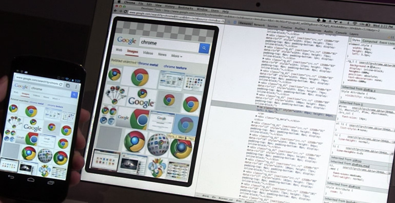
In this context, one clear advantage of mobile web app development (as compared with native app development) is that you can utilize standard browser-based developer tools to debug your application. Based on my personal preference for remote debugging, the one I recommend in this app development tutorial is Chrome with its DevTools. Other standard options include Firefox with Firebug or Opera’s Dragonfly tools.
 Some of the reasons I prefer Chrome with its DevTools include:
- Mobile emulator in Chrome’s DevTools.This is perhaps alone sufficient reason to select Chrome for debugging of mobile web apps. Key features include emulation of touch events, user agent spoofing, network bandwidth throttling, geolocation overrides, device orientation overrides, and CSS Media Type Emulation.
- Interactive editor.Ability to edit JavaScript or CSS on-the-fly.
- Superior JavaScript debugger.Allows for DOM breakpoints and provides the ability to profile your JavaScript code execution time.
- Built-in JSON and XML viewers.Avoids the need for any plugins to inspect server responses.
- Support for the Android Debug Bridge (ADB) protocol directly over USB.Facilitates easy instantiation of a remote debugging session. (Here is a good tutorial by Google on how to start remotely debugging in Chrome.)
- Dynamic inspection of resources.Allows you to inspect your app’s local data sources, including IndexedDB or Web SQL databases, local and session storage, cookies, and Application Cache resources. You can also quickly inspect your application’s visual resources, including images, fonts, and style sheets.
To test the layout and cross browsing compatibility of your web app, you can also use some helpful online tools, such as BrowserStack. Just enter the URL for your application, select the browser, version, and operating system, and you’ll get the emulated view (and load speed) of your site in that environment. Another useful tool for the this purposes is CrossBrowserTesting.
Wrap up
With the continued rapid expansion of the number, variety and sophistication of mobile devices on the market and in use today, the need for effective, user-friendly, high performance mobile applications is likely to increase substantially. Being able to develop these applications intelligently and efficiently will therefore continue to be of paramount importance.
Many factors must be considered when choosing between the web, native, and hybrid options for mobile applications. Each has its own advantages, but mobile web apps will often represent your most efficient development (and therefore time-to-market) option. Should you choose to go down that path, I hope this web app development tutorial helps get you more directly and successfully to your destination.
